
Shays Kitchen is a small catering business based in London. Up until recently, they have been operating by word of mouth, and as the client base is growing they were struggling to keep up with all the orders and administrative needs.
Shays Kitchen

Project overview
Create a brand and an online presence for a London based catering company
Brief
My role in this project was to help bring in more business by rebranding the business, including a new logo and build an easy to navigate website so that clients can order directly from there.
Duration: Two months
Role: End- to end UX/UI Designer
Team: Self directed
Tools: Figma
Problem statement
How might be design a website that makes ordering from Shays Kitchen easy, organized and fast? How might we brand the catering company to be more refined and professional?
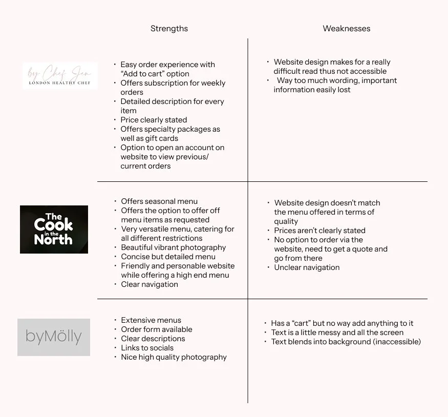
Desk research
For this project it was important for me to have an understanding of how the current market looks. It’s not a hugely dense field especially in the UK, but there are enough private chefs that the competition does exist. It was important to learn from existing websites elements to incorporate and which to avoid.
User research
In order to gather a better understanding of what the clients want; I carried out some user research.
1. Most of the clients (75%) are working either full time or part time.
2. Ordering food from a private chef is a new thing for them.
3. When given a few options as to why they would order from a personal chef (I have no time to cook myself nourishing meals, I want to fill my fridge with some extra meals to grab when I am in a hurry, I like a break from cooking sometimes, To get a friend a care package friend a couple of meals as a gift (for a new baby, new house etc.) 50% selected “all the above”, while 25% selected “I like a break from cooking sometimes), and 25% selected “I want to fill my fridge with some extra meals to grab when I am in a hurry”
4. 50% said they would order once in a while, while 25% said on a weekly basis and 25% were unsure at the moment.
5. When asked what would make them order more often, 65% selected “cheaper prices” and 35% selected “home delivery”
6. 75% said they would be happy to order up to a week in advance, while 25% said they’d order up to two weeks in advance.
7. 50% of the users selected “All the above” when asked what the hardest part of eating a well-balanced diet is, Shopping, cooking, meal planning and lack of time. While the other 50% were split between those who found meal planning and lack of planning to be the most challenging.
8. In terms of updating the menu monthly/according to the season, 80 % selected “Update as the season changes”, 10% wanted a set menu and the other 10% wanted a few staples but would appreciate some changes here and there.
These findings were really helpful when it comes to understanding which features are important to add to the website, which features to highlight, how much time people want to spend ordering, and how often etc. As well as understanding what sort of meal packages would bring in the most business. All in all this data is extremely useful for Shays Kitchen.

Problem
As Shays Kitchen grows, it is too hard to keep track of orders. Clients have to wait to receive the weekly menu, to then order. The process ends up taking a lot longer than necessary.
Additionally, the growth of the client base was great but the lack of brand identity made it difficult to market.

Solution
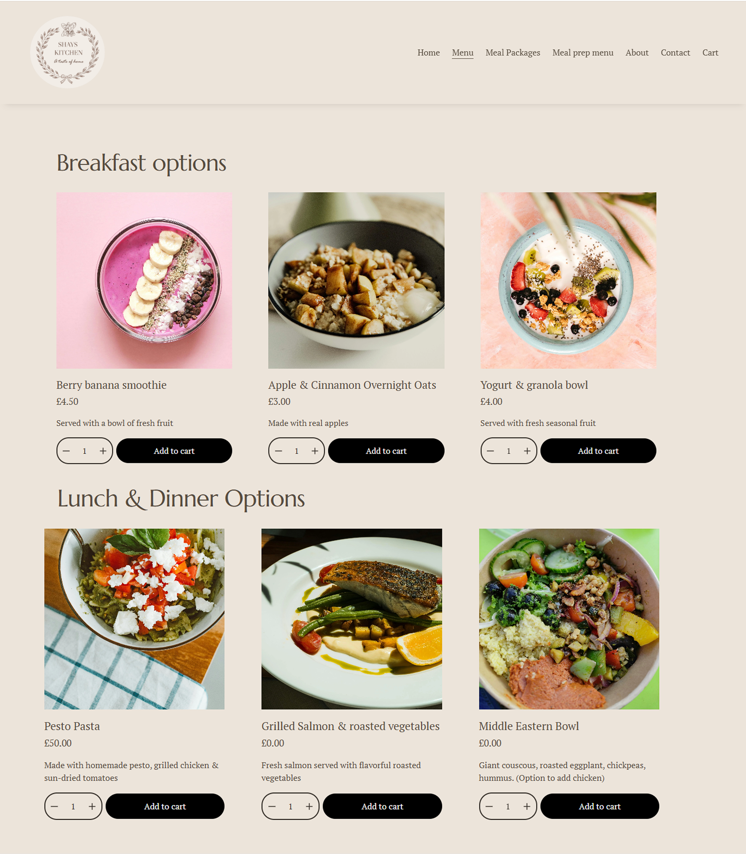
1) To build a responsive website for Shays kitchen to provide a smoother ordering experience, as well as the option to reorder past orders, see full up to date menus and have an online presence.
2) Create a brand that represents them as a company, as well as the clientele they work with.
Personas


Goals

Business goals:
Design new logo to rebrand company
Have a website for the clients to order from
Be able to track all orders
Update the menu seasonally, as well as having a set menu on the website
Incorporate payment method
Increase client base

User goals:
Order easily through website
View current menu options and prices
Order and pay directly via website
Down the line - add in feature that allows clients to reorder past order/have recurring order set up

Technical goals:
Make sure the website is responsive
Ensure the website was abides by accessibility guidelines
Integrate payment method
Flows

Here is an example of a task flow, ordering Pesto Pasta.
Wireframes

The client wanted as basic and clean as possible, so when wireframing I aimed to provide just that.
When I began discussing with the client what design they were going for, it was really important we understood what sort of clientele they were aiming for. The fun part of rebranding or building a brand is having a clean slate that could really go in any direction.
At first the client was adamant to have a simple logo with the name in it with maybe some minor detailing. They expressed how they wanted their website to reflect a luxury brand. However, we then discussed that while “Shays Kitchen” may be aimed at upper class clientele, at the end of the day the brand had to match the product.
So, after much trial and error I designed a logo that was delicate, refined, yet homey.
Branding
Some of the design options presented at the beginning:


When the client saw the first few options, they didn’t like any (If we’re being honest I didn’t either) so we discussed moving away from this style and exploring something very different, which is how we came to the final logo.
When it came to the color palette, the client said they wanted clean, modern, classy but also young. Here are the two mood boards I presented them with:


The logo wasn’t updated at this stage yet*
High fidelity prototypes

Thought process
Designing for this client was more than just a website, but the foundation of their brand.
Brand identity: When designing this brand, the client came in with really specific ideas, so it was interesting trying to match what they envisioned with their clientele.
UI: All the elements are designed to creative a cohesive experience throughout the website.
Proximity: Products placed in correct proximity with price, details etc. to make for easy user experience.
Closing thoughts
Project reflections
This was a really enjoyable project, working with a client who came in with a vision and working together to morph into reality with a few tweaks here and there.
I thought it was interesting to find a simple way to integrate the ‘build your own section’.
Overall, I would consider it a successful project, pretty straightforward and simple.
Being
Challenges
The main challenge was getting on the same page for the design ideas. Helping the client understand how to build a brand that fit their users, as supposed to creating a brand based off of a brand they really like but that sells a very different product.
Next steps
In the future, once the clientele base grows, we would like to integrate a seasonal menu, an option to reorder previous orders and special off the menu order requests.
The website will be live soon*